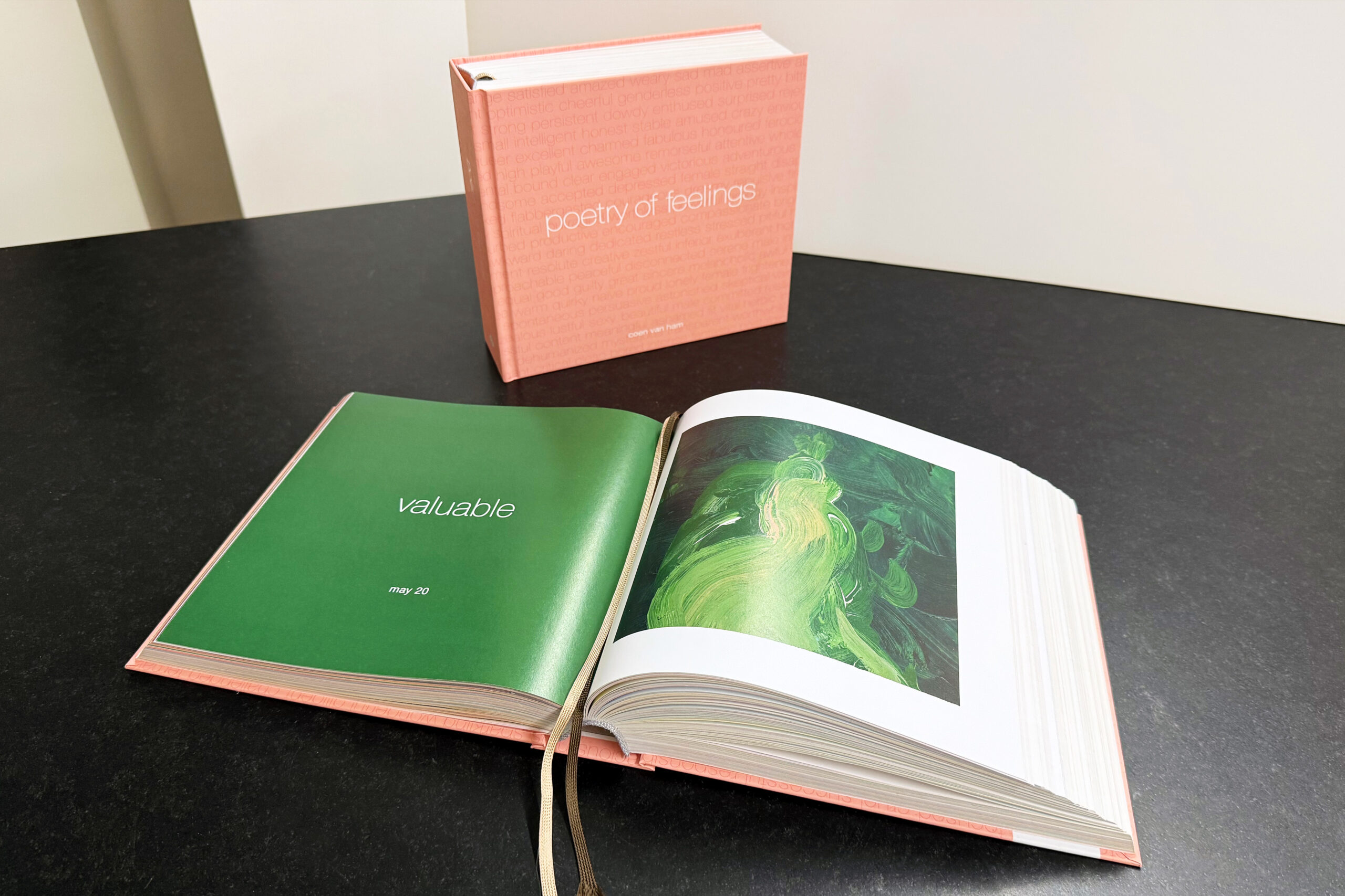
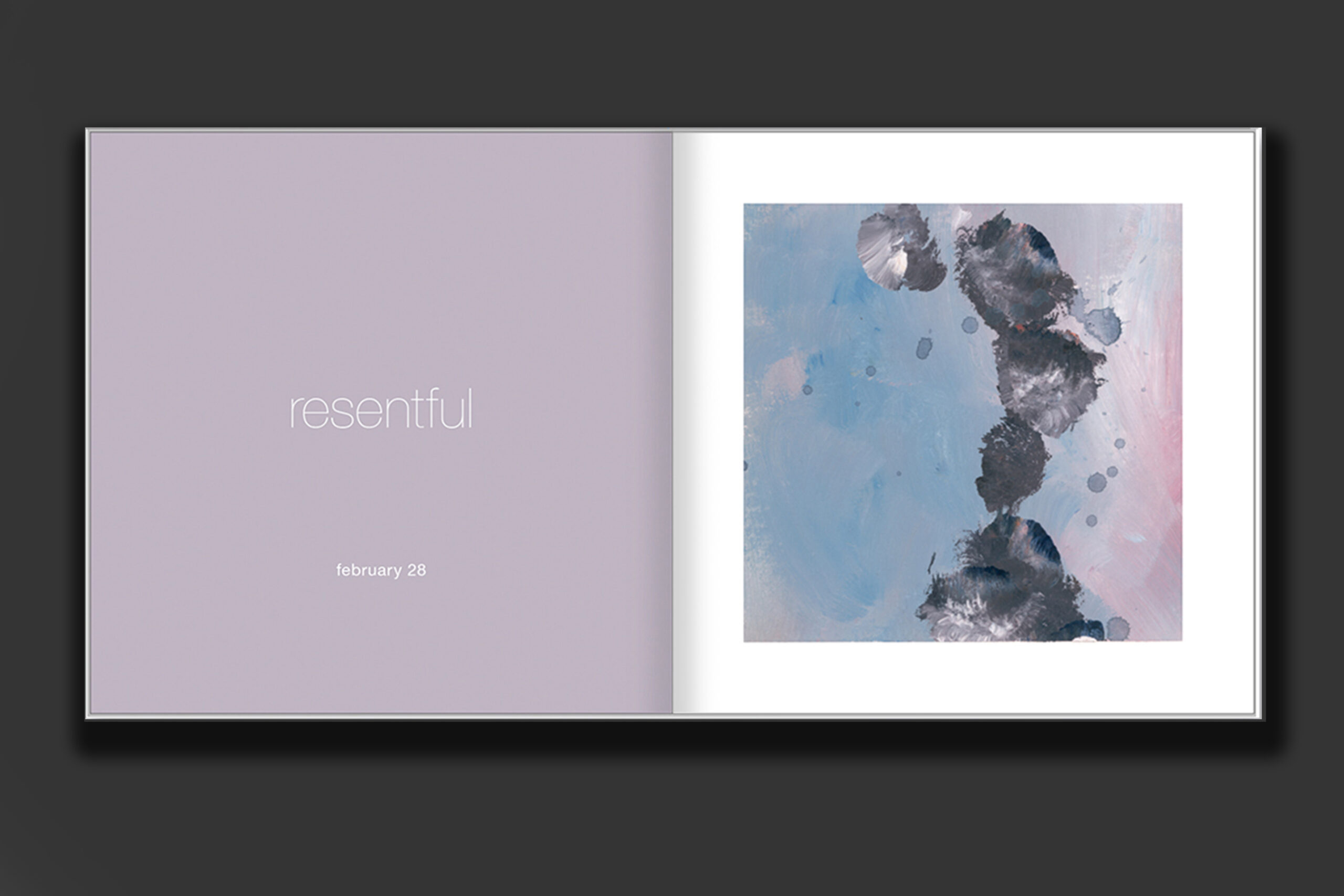
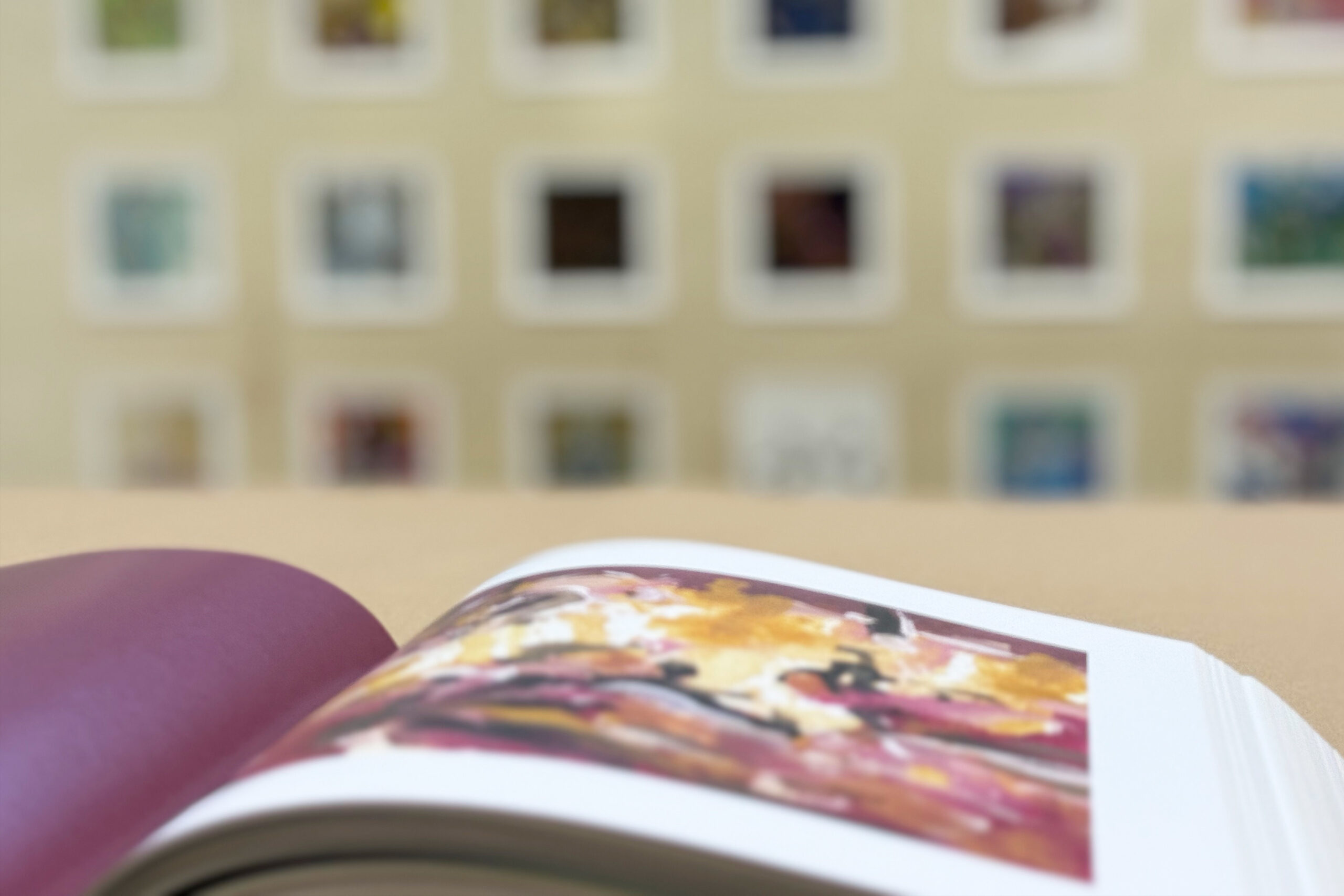
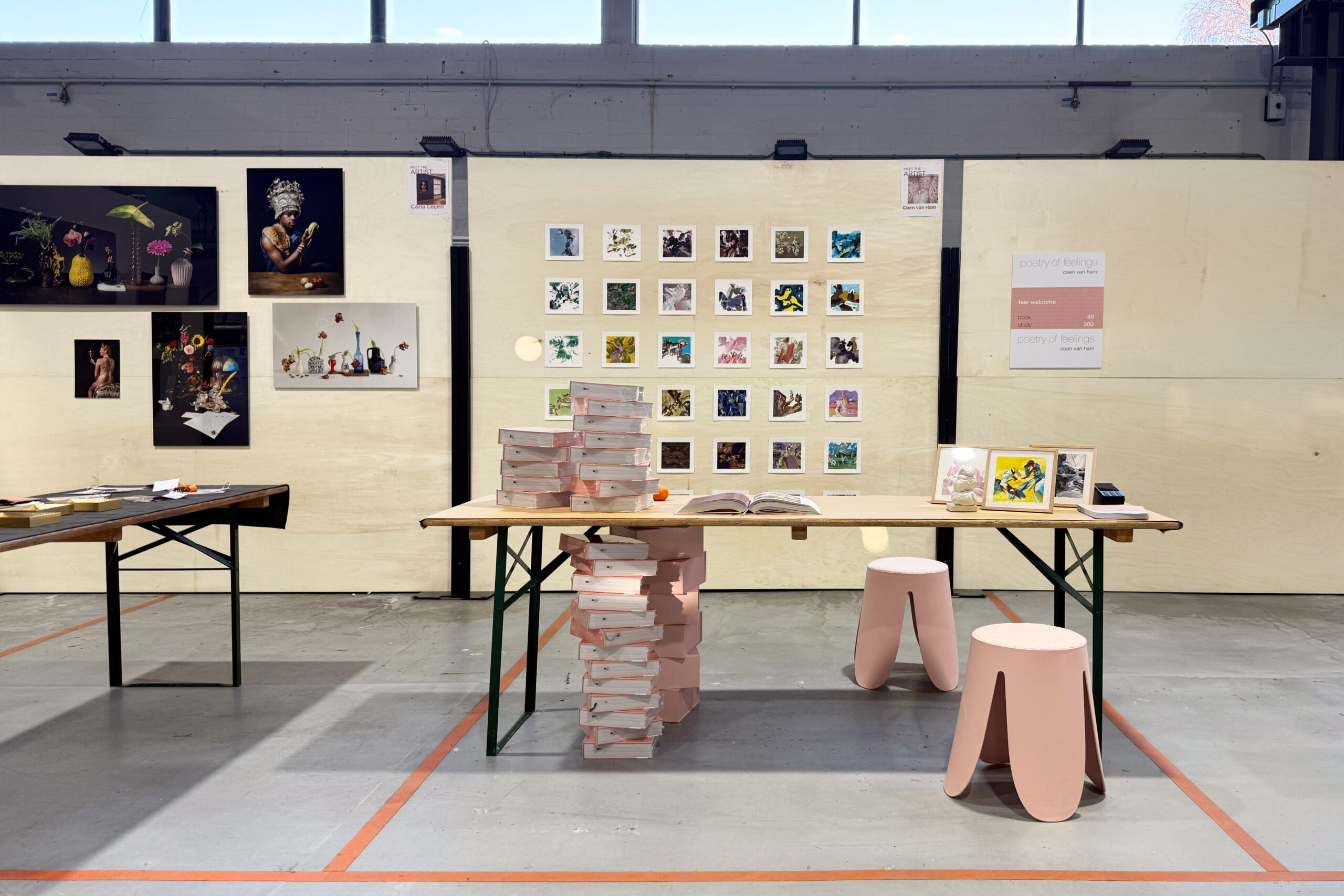
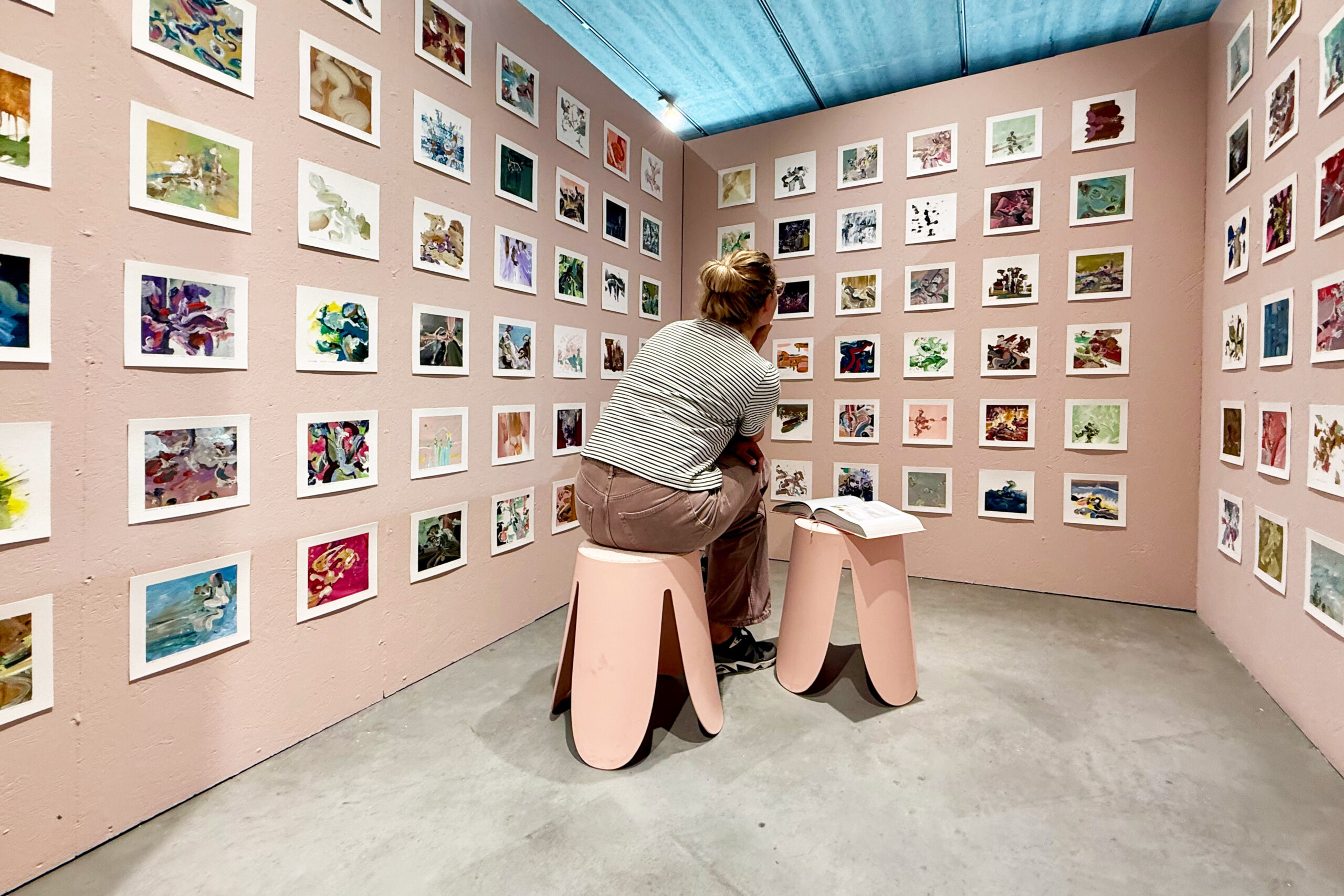
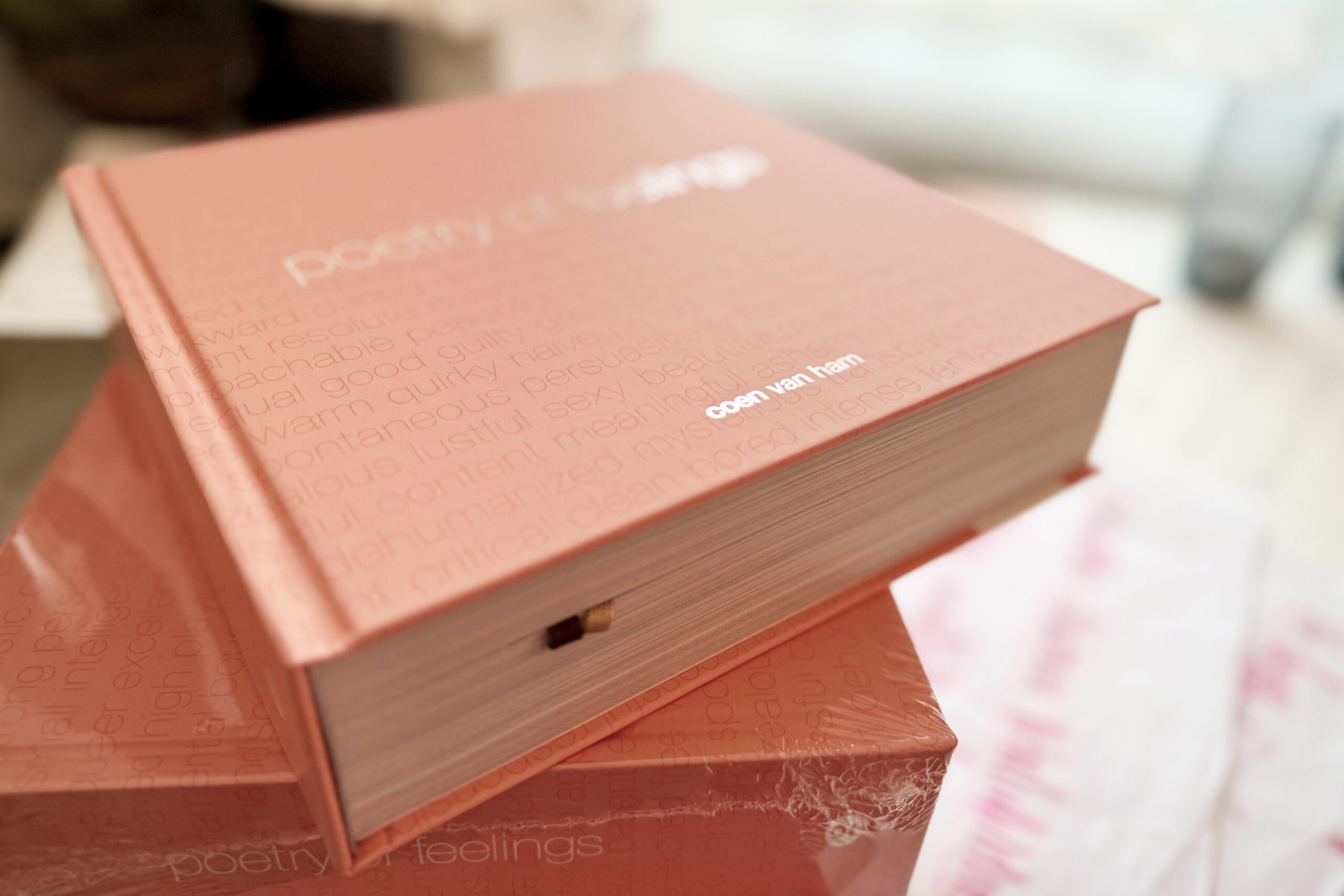
poetry of feelings | 2025 | 752 pages full color calendarium | 210 x 210 x 80mm | own initiative
Hoe geef ik vorm en kleur aan al die verschillende emoties? Kunnen mijn schilderijen helpen om het gesprek over mentale gezondheid aan te gaan? Het ervaren van kunst heeft een positief effect op je gezondheid en welzijn. Dat spreekt me aan. Dat wil ik verder onderzoeken. Daarom schilderde ik 366 verschillende gevoelens. En maak ze voor iedereen zichtbaar in een kalenderboek. Poetry of feelings. Om elke dag aandacht te geven aan emotionele gezondheid. Om even te voelen. Gewoon jezelf te ervaren. Stil te staan bij wat er is. Hoe voel jij je vandaag? Welke gevoelens heb jij? Toon jij jouw emoties? En deel je ze met anderen? Ik voel. Voel mezelf. Voel jij met mij mee? Lees meer op deze speciale projectpagina. Je kunt het boek hier bestellen.
How do I form and colour in all those different emotions? Can my paintings help initiate the discussion about mental health? Experiencing art has a positive effect on your health and well-being. That appeals to me. I want to look into that further. That’s why I painted 366 studies of different feelings. They’ll be visible to everyone in a calendar book. Poetry of feelings. So there’s a focus on emotional health every day. So you feel for a moment. Just experience yourself. To reflect on what is there. How are you feeling today? What feelings do you have? Do you let your emotions show? And do you share them with others? I feel. Feel like myself. Join me in feeling? Read more on this special project page. You can order your copy here.
2021 | concrete and laser cut brass | 2500 x 1000 x 1000mm | municipality of valkenswaard
Een gouden kroon vol nieuw leven herrijst uit de as. Deze levenskroon geeft eer en aandacht aan mensen die hier hun laatste rustplaats vinden. Een krans van geabstraheerde natuurlijke vormen die straalt en schittert. Het messing kunstwerk laat je wegdromen in verloren gedachten. Het herinnert ons aan gouden glorie. De betonnen sokkel waar de kroon op rust geeft ruimte aan de namen van de overledenen die rusten op dit strooiveld.
A golden crown full of new life rises from the ashes. This ‘crown of life’ honors and commemorates the people who find here their last resting place. A sparkling and shiny wreath of abstract natural shapes. This brass piece of art makes you dream away in lost memories. It reminds us golden glory. Nameplates of the deceased, resting on this scattering field, are attached to the concrete base that carries the names of all people lying here.


2017 | polished and etched stainless steel | 500 x 1000 x 1000mm | municipality of valkenswaard
Bij de entree van het herinneringsbos in Valkenswaard staat dit momentmonument. Een kunstwerk dat een moment aandacht geeft aan herdenken, herinneren en de cyclus van het leven. Het kunstwerk is uitgevoerd in spiegelend roestvrij staal. Hierdoor reflecteert het de groene omgeving en de blauwe lucht: een teken van nieuw leven. Op de bovenzijde van het momentmonument schreef ik een gedicht:
lopend op je levenspad, ontmoet je iets van waarde, en dan de wind, vangt vallend blad, laat rusten op de aarde, geeft voeding aan jouw waarde
This moment monument is located at the entrance of the remembrance forest in Valkenswaard. A piece of art reflecting on commemorating, remembering and the circle of life. The object is handmade in reflective stainless steel. This material reflects the green environment and the blue sky: a sign of new life. On top of the momentmonument I wrote a poem:
then the wind, catches leaf, lays down on earth, withered belief, feeding sprouting grief


2016 | 752 pages full color calendarium | 210 x 210 x 80mm | own initiative
Stel je het gevoel van de bank van oma eens voor, of de geur van je geliefde parfum. Poetry of things is een kalenderboek met 366 gedichten over de emotionele waarde van alledaagse dingen. Reflecties over een fiets, koffie, boek, schilderij of stoel. Dit door Coen geschreven en vormgegeven kalenderboek is een publicatie vol verwondering, waarden, duurzaamheid en rituelen. Het is hier verkrijgbaar.
Imagine the feeling of your grandmother’s chair, the smell of your lover’s perfume or the sound of silence in a theatre. Everything tells its own story. Plenty of poems have been written about people. But why not create poems about everyday objects? Read these five-line Pentapoems written by Coen van Ham about some material objects that remind you of immaterial values. In this calendar book you’ll find a pentapoem every day of the year. The book is here available.


2011 | digital artwork | mad + municipality of eindhoven
Hoe maak je statistische informatie aantrekkelijk zichtbaar? ‘Living Data’ is een digitaal kunstwerk voor de gemeente Eindhoven. Iedere handeling in het stadskantoor heeft een eigen symbool. Alle symbolen vormen samen een kleurrijk stadsbeeld. Het ritme van de stad wordt zo voelbaar. De bezoeker wordt onderdeel van het kunstwerk en zo onderdeel van een dynamische stad.
How to make statistics visible in an attractive way? With ‘Living Data’, a digital artwork in the hall of the municipal office of the city of Eindhoven. Every action in the office has its own symbol. All symbols together form a colourful cityscape. The rhythm of the city becomes tangible. The visitor becomes part of the artwork and thus turns into a part of a dynamic city.


2011 | various materials and sizes | verus | woerden
Hoe verbeeld je de raakvlakken van twee verschillende geloofsorganisaties in het onderwijs in een passend interieur? COEN! heeft voor de Besturenraad en BKO in Woerden een werkomgeving met identiteitslaag ontworpen. De organisaties behartigen de belangen van christelijk en katholiek onderwijs in Nederland. Voor het ontwerp is Het Boek als metafoor genomen als relatie tussen geloof en onderwijs.
How to visually connect the shared goals and principles of organisations that take care of differtent denominational types of education in an interior? COEN! created a new working environment and identity layer for two organizations, Catholic and Protestant, that are going to cooperate more intensively. For the design of the relation between faith and education, COEN! used The Book as a metaphor.


2010 | photo print behind plexiglass | 600 x 900 mm | own initiative
Shanghai. Stad van uitersten? Ontwikkelingen gaan hier sneller dan het licht met de achtergrond van een eeuwenoude traditie. Shanghai inspireerde Coen van Ham tijdens een werkbezoek. Hij ving deze in intrigerende beelden en gaf ze de naam Digifish. Raak geïnspireerd door zijn impressie van, en reflectie op, deze achttien miljoen mensen metropool.
Shanghai. City of contrasts? In this environement developments go faster than light in a world of ancient traditions. Shanghai inspired Coen van Ham during his visit in 2010. He captured this inspiration in intriguing images and named them Digifish. Let his impression and reflection of this eighteen million people metropolis inspire you as well!


2010 | 4000 x 4000 x 1400mm | enabled steel | mbo raad | woerden
Een gedateerd gebouw een nieuwe impuls geven zonder de gevel te wijzigen? Een uitdaging! Voor het gebouw van de MBO Raad staat het door COEN! ontworpen kunstwerk ‘Poort naar de toekomst’. Deze poort symboliseert de toegankelijkheid van alle opleidingen in het mbo. Dit kleurrijke, vijf meter hoge object markeert de ingang van het gebouw en geeft kleur aan de omgeving.
Give a dated building a new look without changing the facade? The ‘MBO Raad’ is the Dutch Association of VET Colleges. The entrance to the building of this educational organization is highlighted by a colourful arch. COEN! created this art object called ‘gate to the future’, symbolizing the access to education. A welcoming landmark in full colour.


2010 | various sizes and materials | mbo raad | woerden
Kun je zestien beroepenvelden van het middelbaar beroepsonderwijs laten zien in een interieur? De MBO Raad werkt in een kleurrijk kantoor, ontworpen door COEN! en de architecten ‘Bos en Alkemade’. Een prettig werk- en leef- landschap dat vloeiend in elkaar overgaat. En hierin klinkt een opvallende identiteitslaag: speciaal voor dit project zijn zestien patronen vormgegeven op wanden, meubilering en lampen.
Is it possible to show the various professional fields of all VET-colleges? This office space of the Dutch Association of VET-Colleges was re-created by COEN! and architects ‘Bos en Alkemade’ to form a light, colourful and attractive working environment. You see also sixteen colourful graphic patterns for this organisation, representing the various professional fields, printed on wall coverings and furniture.


2009 | MDF, wood veneer, 24 carat gilded brass | 210 x 280 x 41cm | edition 33 | own initiative
De excentrieke en rijke uitstraling van het katholieke geloof fascineert. Hiernaast is er een geloof ontstaan in de wereldeconomie, met materialisme als grote god. Coen van Ham onderzocht het spanningsveld tussen het stoffelijke en het spirituele. Met als resultaat een reversie van het kruis. Kies je voor de spirituele waarde of de materialistische waarde eromheen? Geloof je in een God, in jezelf, of in de kracht van in de economie? Of wellicht in een stoffelijke én een spirituele wereld?
The eccentric and ornate atmosphere of the Catholic religion has always fascinated a great many people. In addition, a new religion has developed with a belief in the global economy and with materialism as the one God. This search for new meaning leads to inner reflection. Coen van Ham delved into the tension that exists between the material and the spiritual. The result was a reversion based on the cross. Will you choose the deeper spiritual value or the material value on the surface? Do you believe in God, in yourself, or in the power of the economy? Or perhaps you believe in a material as well as a spiritual world?


2006 | Giclée on paper | 500 x 700mm, giclee | edition: 50 | npo
Hoe vertaal je een organisatie in een aansprekend mediakunstwerk? Het testbeeld is door COEN! opnieuw ontworpen als verbeelding van de nationale Publieke Omroep. Dit in het kader van het herontwerp van het interieur door COEN! Het vertrouwde testbeeld is vertaald naar kleurrijke kunstuitingen in het gebouw. Gebaseerd op dit ontwerp is een serie van zestien kleurrijke giclees gemaakt, die samen het testbeeld vormen. Testbeeld 2.0
How to translate the identity of a company into an appealing media art form? COEN!! redesigned the TV test picture to symbolize the National Broadcasting Company. This in the context of the redesign of the interior by COEN! The well-known test picture was translated into colourful art forms throughout the media building. Based on the same design, a series of 16 colourful giclees was produced, which when taken together form the complete test picture. In a 2.0 version.


2001 | 2700 x 1500 x 1500mm | stainless steel and painted steed with neon light | eindhoven
High tech en high touch: Technologie en een rossig verleden gecombineerd in een kunstwerk? COEN! gaf in opdracht van de gemeente Eindhoven vorm aan ‘Red Wire’. Een voorbeeld van social design: met de buurt is dit project uiteindelijke tot stand gekomen. Een rode draad wringt zich door metalen ringen door de weg naar het buurtcentrum. Om daar dag en nacht lichtsignalen te geven aan een levendige buurt.
Art for a colourful neighborhood? COEN! created ‘Red Wire’: a sculpture for the city of Eindhoven. It connects this lively area with the rest of the city. A red wire wriggles through metal rings in and out of the pavement, to end triumphant in the facade of a community centre. On the end of it, the electric wire is exposed. This exposed heart pulses light signals in the dark. A good example of social design.


